FitBuddy
HomeOne of the most valuable decisions we made while building FitBuddy was adopting a UI-first development approach. Instead of getting bogged down in backend complexities early on, we focused on creating a polished user experience with mock APIs and static data. This strategy proved instrumental in rapid prototyping and user experience validation.
The Mock API Strategy
Rather than waiting for a fully functional backend, we built comprehensive mock APIs that simulated real data interactions. This allowed us to develop and test the entire user flow without any backend dependencies, enabling parallel development and faster iteration cycles.
AI-Powered Logo Design
Working with Claude Code, we designed a distinctive logo that captures the essence of FitBuddy's social fitness mission. The collaborative AI design process allowed us to explore multiple concepts quickly and refine our visual identity.
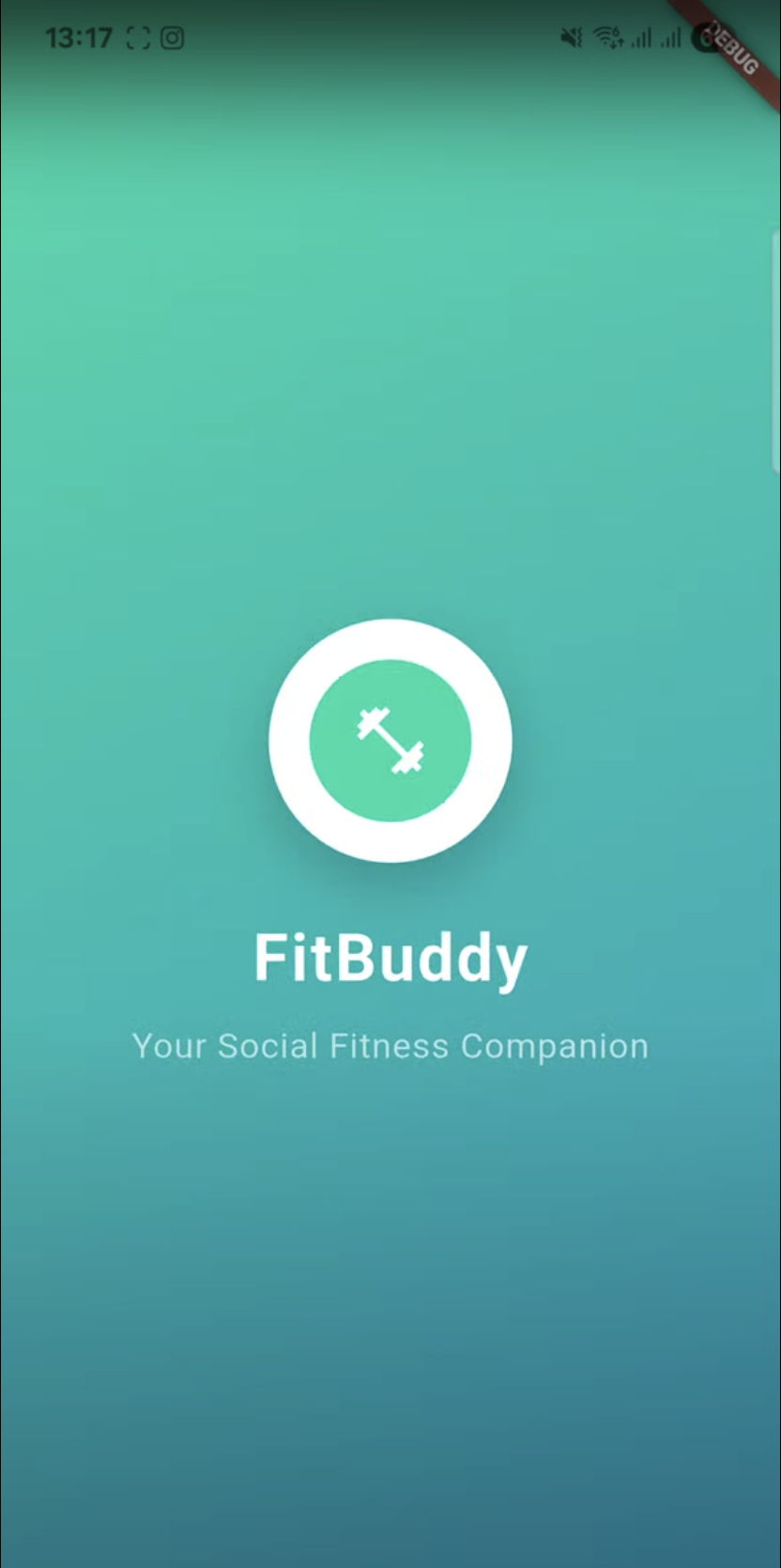
FitBuddy splash screen featuring our AI-designed logo
Building Core User Experiences
Profile Screens: Dual Perspectives
We developed both editable and read-only profile views, understanding that users would need to both manage their own profiles and view others'. This dual approach ensures consistency while providing appropriate functionality for each use case.
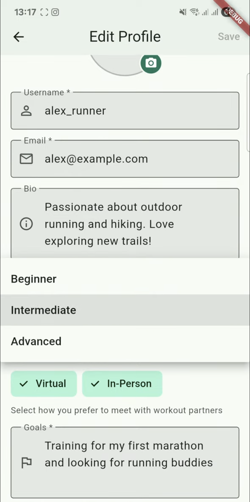
Editable profile view
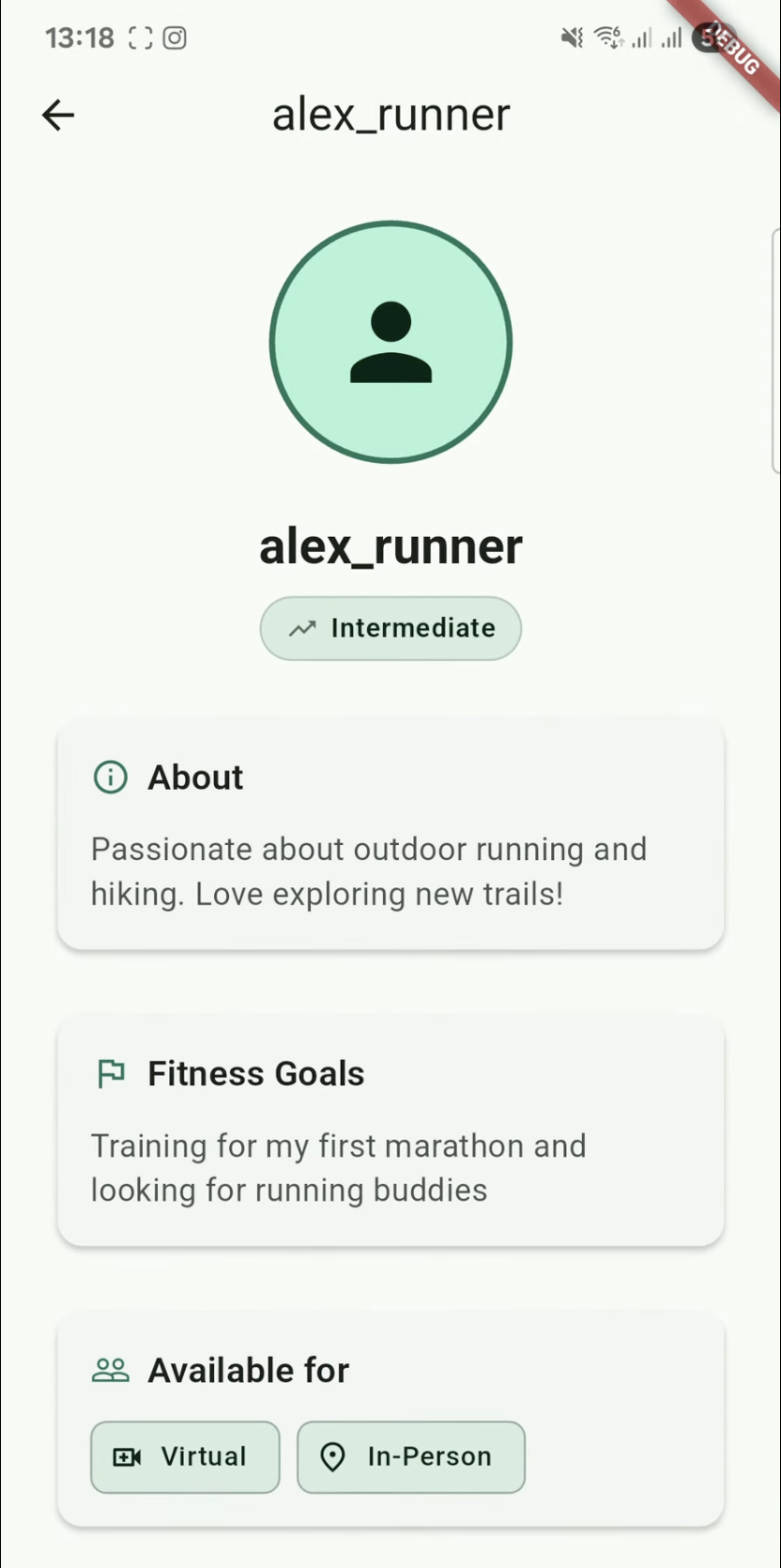
Read-only profile view
Navigation Foundation
We established the core navigation structure early, ensuring users could intuitively move between key sections of the app. This foundation proved crucial for maintaining consistent UX patterns as we added features.
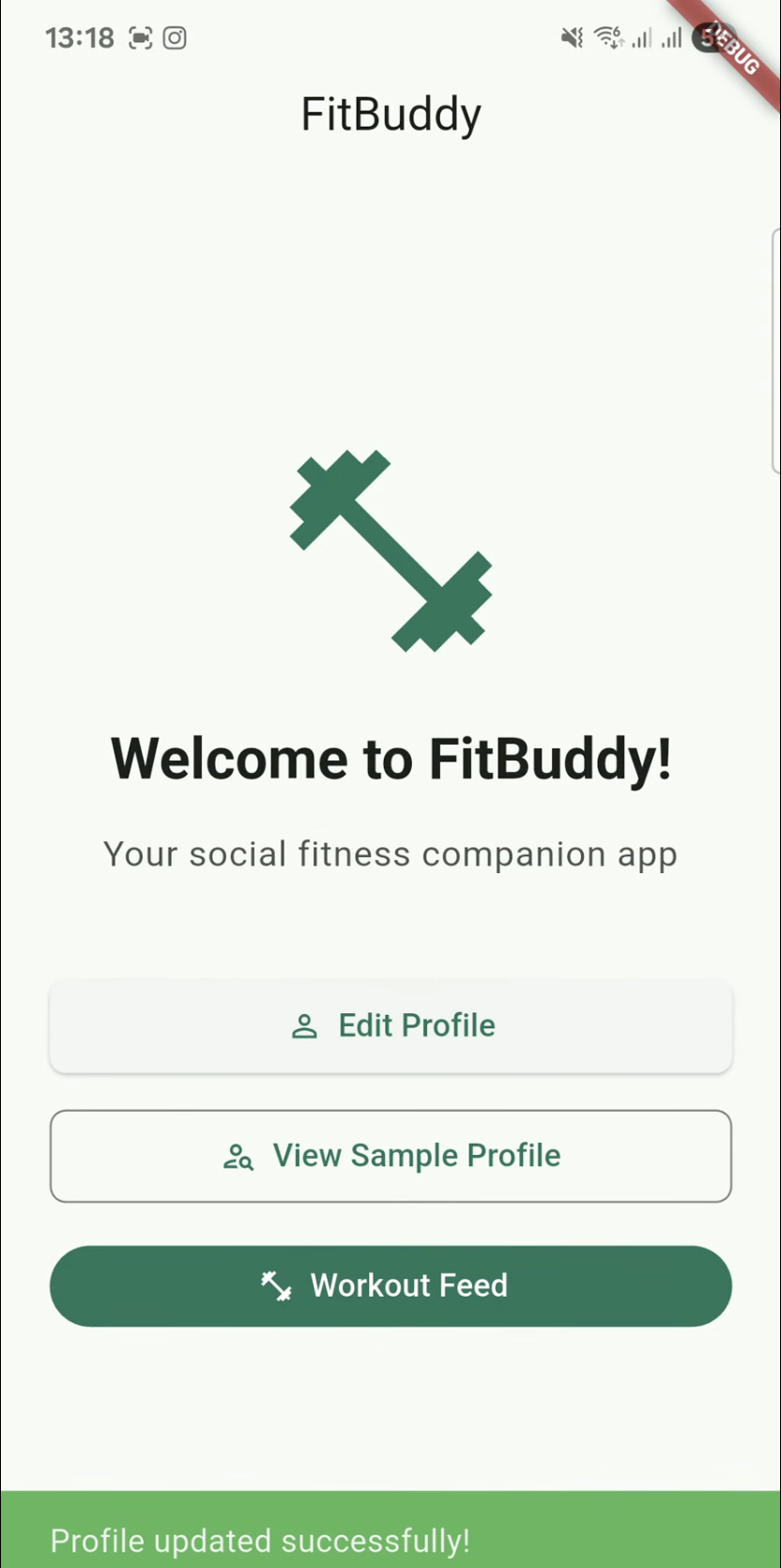
Clean, intuitive navigation design
Workout Feed: The Heart of Social Fitness
The workout feed represents the core of FitBuddy's value proposition – a place where users can discover workouts they might want to join and see what their fitness community is up to. We spent considerable time perfecting this flow, as it's where the magic of social accountability happens.
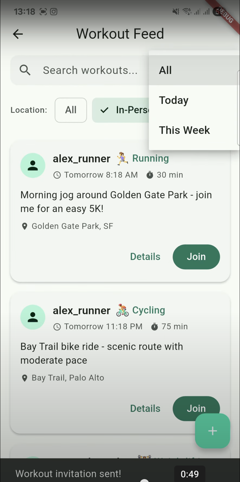
Workout feed showing upcoming activities and join options
Benefits of UI-First Development
Accelerated User Experience Testing
With a working UI powered by mock data, we could immediately test user flows and gather feedback. This approach allowed us to identify UX issues and iterate on design decisions without the complexity of backend integration.
Faster Design Process
The UI-first approach dramatically accelerated our design process. Instead of designing in isolation and hoping it worked when implemented, we were designing with real, interactive components. This tight feedback loop between design and development meant fewer surprises and more confident design decisions.
Clear Backend Requirements
By building the UI first, we developed a crystal-clear understanding of exactly what our backend needed to support. When we eventually built the real APIs, we knew precisely what data structures, endpoints, and functionality were required.
Lessons Learned
The UI-first approach proved invaluable for FitBuddy's development. It allowed us to validate our core concepts quickly, refine the user experience iteratively, and maintain momentum while making complex architectural decisions. Most importantly, it ensured that user experience remained at the center of every technical decision.
For any startup building a user-facing application, consider starting with the interface. It's not just about faster development – it's about building something people actually want to use.